10 Instagram Feed Themes to Brand Yourself and Your Business
Creating a consistent Instagram theme plays a vital role to your business account. It is your way of making your great first impression when users land on your page because that is the first thing they visually see. Thus, Instagram is not just about posting memories and selfies anymore. It is now also used as a platform to brand yourself or your business.
If you are scratching your head and having a hard time figuring out which aesthetic is best for you, then I may have some ideas to help you out. I have looked at some irresistible Instagram profile accounts that stood out and can be used for you to get some inspirations to recreate and have your own spin to it. Here are some of my favorite aesthetic ideas from photographers, bloggers, brands and influencers who take their Instagram themes seriously:
1 . Bright and Soft Pastel by @Topolindra


Verena & Conrad’s Instagram page are filled with bright fairytale looking photos. What I love about their aesthetic is that they stick to a 3-color palette. They change their color palette once in a while but you can tell that they still have the same style of soft pastel styled editing techniques. From the first photo above, they used the split complementary colors of orange which are the purple and teal as their color palette. To make life easier, you can calculate what colors complement each other by using color wheel calculator.
For travel, photo editing and Instagram tips, follow their journey on www.topolindra.com.
2. Strong Vibrant Colors by @milesofcolor
One look at Miles McCormack’s Instagram feed and you can already tell that he has a talent for photo editing. If I was hiring a photo editor and landed on his page, I would have probably given him the job.
That is what got him the follows and that’s also what could lead him to different opportunities. It is a great platform for him to showcase his passion but he also made sure to build an aesthetic around it to keep the viewers scrolling. He chose neon blue and pink as a perfect blend to his shots and boldly increased their vibrance and saturation. To top it off, he adds his own magical touch with his Photoshop overlays.
Check out some of Miles’ Photoshop behind-the-scenes editing techniques and tricks to get this look on his Youtube Channel.
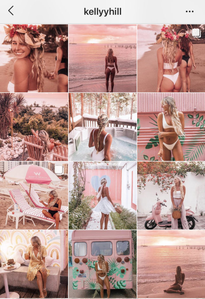
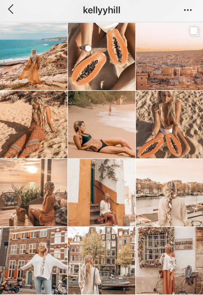
3. Creamy Warm Tones by @KellyyHill


Kelly has more of an analogous color scheme approach. She would use one color as her dominant color and then work her way around it by making her whole feed looking consistent. From the photos above, you can see that she chose creamy warm tones with pink and orange as the main colors for each Instagram block. To make things easier, Kelly also made her own presets for her look so that she can edit her photos with just one click. This made her whole feed pleasing to look at and made her Instagram feed as the perfect way to tell her travel stories.
If you like her style, go ahead and take a look at Kelly Hill’s Lightroom presets at shop.kellyyhill.com
4. Clean & Minimalistic by @lovetram

Food blogger Tram gives a more minimalistic and elegant style to her Instagram aesthetic. She uses a lot of negative space to put more emphasis on the subjects or products.
She mixes her profile up with some flat lays, product photographs and herself of course. Notice that she was wearing classic black outfits with white backgrounds.
This look is used a lot for fashion bloggers as well. If the focus is on the outfit, you can appreciate it more when the background is not so busy.
You wouldn’t want the background to take over the shot when your are trying to market your product.
For some mouthwatering meals and deserts, check her Facebook Like Page on www.facebook.com/lovetramofficial .
5. Powder Matte by @melissagasia
Yours truly.
What love about having a blue theme is that it is super easy because there is always the blue sky to depend on.
If you’re feed is mostly about being outdoors and around the pool then you won’t have to restrict yourself too much about coordinating your outfits, finding the perfect walls or getting the right props
In this feed, I just used the same preset and made a few tweaks to it to make sure the blues are looking more powder blue.
Check the preset by clicking here:
http://shewillspill.com/product/powder-matte/
6. Bold Colorful Pop by @iamfashionlaine
Do you want a feed that would brighten your day?
My first thought after seeing her feed was that I definitely want to be her friend.
Her feed shows so much personality and creativity to her work.
Elaine chose to have her feed filled with multiple bold and bright colors similar to highlighters.
These color pops can be addictive to look at and gives a fun and cheerful vibe to her Instagram theme. Elaine didn’t have to limit herself on one to three colors and yet it worked perfectly in her favor.
If you want to learn more about her, go and see her blog filled with fashion, beauty and travel tips on www.fashionlaine.com.
7. Vintage Moody by @kyliekatich

Content creator Kylie Katich has given a total Urban Outfitter and Free People vibe with her Instagram profile.
She brings out a moody vintage energy to her theme by embracing the neutral colors and bringing them to life.
Her feed is combination of indoor and outdoor photographs, and she does a great job of balancing them together by having a little bit of both.
Kylie takes a more natural approach by not overly altering the colors, but by adding warmth to her tones. She instead puts more focus on giving her shots an earthy brown tone for her aesthetic.
These looks are perfect for autumn and fall lifestyle magazines.
If you like her style, take a look at her presets at gum.co/newkyliepresets.
8. Rotating Rainbow Block by @drinkbev


Guilty as charged, but I had a drink of Bev’s Rosé can at a wine convention center. I checked out their Instagram account page on the spot and wow, how much dedication have they put on their feed just made me tap that follow button. If you scroll through their profile, you will basically see a rotating rainbow color.
Every grid is following one basic color and then changing after 9-12 photos. I am glad that they didn’t just vomit on us with photos of just their product. The Bev team mixed their feed with an 80’s retro theme. For brands and businesses, the golden rule to posting is always to inspire, educate and promote.
Anyways, if you’d like to have some casual and chill Rosé cans with your friends, check out their webpage www.drinkbev.com.
9. The Classic Orange and Teal

The color grading technique of achieving the orange and teal look has been very popular among famous photographers and videographers. This style is designed to give photos a more cinematic blockbuster style.
As mentioned before, the color wheel calculator is a great way to figure out what colors to mix and match. Orange and teal complement each other because they are both opposites on the color wheel.
With this feed, it would be good when a photo with a lot of orange is put next to a photo that has more teal to have some good balance altogether.
You can check out and download the Orange and Teal Mobile Lightroom preset pack: http://shewillspill.com/product/orange-teal/
10. Pop of Red @margusha___

I mean, who doesn’t love the color red?
Margarita chose to keep her foundations white while giving some hints of red on each photo. She made her white backgrounds whiter and added saturation to her reds to make sure that the reds pop and so that you’re attention will focus on it.
Even if it is a small prop or her red lips, you can easily spot it without even trying. If you are selling products, pops of reds would be a great way to promote your products. Margarita also likes to work with her string lights that add effect to her photos and make them more majestic.
So tell me, which Instagram theme was your favorite? I am very curious?!


